Principal Components Analysis
Principal Components Analysis in R: Step-by-Step Example
Principal components analysis, often abbreviated PCA, is an unsupervised machine learning technique that seeks to find principal components – linear combinations of the original predictors – that explain a large portion of the variation in a dataset.
The goal of PCA is to explain most of the variability in a dataset with fewer variables than the original dataset.
For a given dataset with p variables, we could examine the scatterplots of each pairwise combination of variables, but the sheer number of scatterplots can become large very quickly.
For p predictors, there are p(p-1)/2 scatterplots.
So, for a dataset with p = 15 predictors, there would be 105 different scatterplots!
Fortunately, PCA offers a way to find a low-dimensional representation of a dataset that captures as much of the variation in the data as possible.
If we're able to capture most of the variation in just two dimensions, we could project all of the observations in the original dataset onto a simple scatterplot.
The way we find the principal components is as follows:
Given a dataset with p predictors: X1, X2, … , Xp,, calculate Z1, … , ZM to be the M linear combinations of the original p predictors where:
Zm = ΣΦjmXj for some constants Φ1m, Φ2m, Φpm, m = 1, …, M.
Z1 is the linear combination of the predictors that captures the most variance possible.
Z2 is the next linear combination of the predictors that captures the most variance while being orthogonal (i.e.
uncorrelated) to Z1.
Z3 is then the next linear combination of the predictors that captures the most variance while being orthogonal to Z2.
And so on.
In practice, we use the following steps to calculate the linear combinations of the original predictors:
1. Scale each of the variables to have a mean of 0 and a standard deviation of 1.
2. Calculate the covariance matrix for the scaled variables.
3. Calculate the eigenvalues of the covariance matrix.
Using linear algebra, it can be shown that the eigenvector that corresponds to the largest eigenvalue is the first principal component.
In other words, this particular combination of the predictors explains the most variance in the data.
The eigenvector corresponding to the second largest eigenvalue is the second principal component, and so on.
This tutorial provides a step-by-step example of how to perform this process in R.
Step 1: Load the Data
First we'll load the tidyverse package, which contains several useful functions for visualizing and manipulating data:
library(tidyverse)
For this example we'll use the USArrests dataset built into R, which contains the number of arrests per 100,000 residents in each U.S.
state in 1973 for Murder, Assault, and Rape.
It also includes the percentage of the population in each state living in urban areas, UrbanPop.
The following code show how to load and view the first few rows of the dataset:
#load data
data("USArrests")
#view first six rows of data
head(USArrests)
Murder Assault UrbanPop Rape
Alabama 13.2 236 58 21.2
Alaska 10.0 263 48 44.5
Arizona 8.1 294 80 31.0
Arkansas 8.8 190 50 19.5
California 9.0 276 91 40.6
Colorado 7.9 204 78 38.7
Step 2: Calculate the Principal Components
After loading the data, we can use the R built-in function prcomp() to calculate the principal components of the dataset.
Be sure to specify scale = TRUE so that each of the variables in the dataset are scaled to have a mean of 0 and a standard deviation of 1 before calculating the principal components.
Also note that eigenvectors in R point in the negative direction by default, so we'll multiply by -1 to reverse the signs.
#calculate principal components
results <- prcomp(USArrests, scale = TRUE)
#reverse the signs
results$rotation <- -1*results$rotation
#display principal components
results$rotation
PC1 PC2 PC3 PC4
Murder 0.5358995 -0.4181809 0.3412327 -0.64922780
Assault 0.5831836 -0.1879856 0.2681484 0.74340748
UrbanPop 0.2781909 0.8728062 0.3780158 -0.13387773
Rape 0.5434321 0.1673186 -0.8177779 -0.08902432
We can see that the first principal component (PC1) has high values for Murder, Assault, and Rape which indicates that this principal component describes the most variation in these variables.
We can also see that the second principal component (PC2) has a high value for UrbanPop, which indicates that this principle component places most of its emphasis on urban population.
Note that the principal components scores for each state are stored in results$x.
We will also multiply these scores by -1 to reverse the signs:
#reverse the signs of the scores
results$x <- -1*results$x
#display the first six scores
head(results$x)
PC1 PC2 PC3 PC4
Alabama 0.9756604 -1.1220012 0.43980366 -0.154696581
Alaska 1.9305379 -1.0624269 -2.01950027 0.434175454
Arizona 1.7454429 0.7384595 -0.05423025 0.826264240
Arkansas -0.1399989 -1.1085423 -0.11342217 0.180973554
California 2.4986128 1.5274267 -0.59254100 0.338559240
Colorado 1.4993407 0.9776297 -1.08400162 -0.001450164
Step 3: Visualize the Results with a Biplot
Next, we can create a biplot – a plot that projects each of the observations in the dataset onto a scatterplot that uses the first and second principal components as the axes:
Note that scale = 0 ensures that the arrows in the plot are scaled to represent the loadings.
biplot(results, scale = 0)
 From the plot we can see each of the 50 states represented in a simple two-dimensional space.
The states that are close to each other on the plot have similar data patterns in regards to the variables in the original dataset.
We can also see that the certain states are more highly associated with certain crimes than others.
For example, Georgia is the state closest to the variable Murder in the plot.
If we take a look at the states with the highest murder rates in the original dataset, we can see that Georgia is actually at the top of the list:
#display states with highest murder rates in original dataset
head(USArrests[order(-USArrests$Murder),])
Murder Assault UrbanPop Rape
Georgia 17.4 211 60 25.8
Mississippi 16.1 259 44 17.1
Florida 15.4 335 80 31.9
Louisiana 15.4 249 66 22.2
South Carolina 14.4 279 48 22.5
Alabama 13.2 236 58 21.2
Step 4: Find Variance Explained by Each Principal Component
We can use the following code to calculate the total variance in the original dataset explained by each principal component:
#calculate total variance explained by each principal component
results$sdev^2 / sum(results$sdev^2)
[1] 0.62006039 0.24744129 0.08914080 0.04335752
From the results we can observe the following:
The first principal component explains 62% of the total variance in the dataset.
The second principal component explains 24.7% of the total variance in the dataset.
The third principal component explains 8.9% of the total variance in the dataset.
The fourth principal component explains 4.3% of the total variance in the dataset.
Thus, the first two principal components explain a majority of the total variance in the data.
This is a good sign because the previous biplot projected each of the observations from the original data onto a scatterplot that only took into account the first two principal components.
Thus, it's valid to look at patterns in the biplot to identify states that are similar to each other.
We can also create a scree plot – a plot that displays the total variance explained by each principal component – to visualize the results of PCA:
#calculate total variance explained by each principal component
var_explained = results$sdev^2 / sum(results$sdev^2)
#create scree plot
qplot(c(1:4), var_explained) +
geom_line() +
xlab("Principal Component") +
ylab("Variance Explained") +
ggtitle("Scree Plot") +
ylim(0, 1)

Principal Components Analysis in Practice
In practice, PCA is used most often for two reasons:
1. Exploratory Data Analysis – We use PCA when we're first exploring a dataset and we want to understand which observations in the data are most similar to each other.
2. Principal Components Regression – We can also use PCA to calculate principal components that can then be used in principal components regression.
This type of regression is often used when multicollinearity exists between predictors in a dataset.
The complete R code used in this tutorial can be found here.
Principal component analysis (PCA) in R
PCA is used in exploratory data analysis and for making decisions in predictive models.
PCA commonly used for dimensionality reduction by using each data point onto only the first few principal components (most cases first and second dimensions) to obtain lower-dimensional data while keeping as much of the data’s variation as possible.
The first principal component can equivalently be defined as a direction that maximizes the variance of the projected data.
The principal components are often analyzed by eigendecomposition of the data covariance matrix or singular value decomposition (SVD) of the data matrix.
Decision Trees in R
Reducing the number of variables from a data set naturally leads to inaccuracy, but the trick in the dimensionality reduction is to allow us to make correct decisions based on high accuracy.
Always smaller data sets are easier to explore, visualize, analyze, and faster for machine learning algorithms.
In this tutorial we will make use of iris dataset in R for analysis & interprettion.
Self Organizing Maps
Getting Data
data("iris")
str(iris)
data.frame’: 150 obs.
of 5 variables:
$ Sepal.Length: num 5.1 4.9 4.7 4.6 5 5.4 4.6 5 4.4 4.9 ...
$ Sepal.Width : num 3.5 3 3.2 3.1 3.6 3.9 3.4 3.4 2.9 3.1 ...
$ Petal.Length: num 1.4 1.4 1.3 1.5 1.4 1.7 1.4 1.5 1.4 1.5 ...
$ Petal.Width : num 0.2 0.2 0.2 0.2 0.2 0.4 0.3 0.2 0.2 0.1 ...
$ Species : Factor w/ 3 levels "setosa","versicolor",..: 1 1 1 1 1 1 1 1 1 1 ...
In this datasets contains 150 observations with 5 variables.
summary(iris)
Sepal.Length Sepal.Width Petal.Length Petal.Width Species
Min. :4.3 Min. :2.0 Min. :1.0 Min. :0.1 setosa :50
1st Qu.:5.1 1st Qu.:2.8 1st Qu.:1.6 1st Qu.:0.3 versicolor:50
Median :5.8 Median :3.0 Median :4.3 Median :1.3 virginica :50
Mean :5.8 Mean :3.1 Mean :3.8 Mean :1.2
3rd Qu.:6.4 3rd Qu.:3.3 3rd Qu.:5.1 3rd Qu.:1.8
Max. :7.9 Max. :4.4 Max. :6.9 Max. :2.5
Partition Data
Lets divides the data sets into training dataset and test datasets.
Exploratory Data Analysis in R
set.seed(111)
ind <- sample(2, nrow(iris),
replace = TRUE,
prob = c(0.8, 0.2))
training <- iris[ind==1,]
testing <- iris[ind==2,]
Scatter Plot & Correlations
library(psych)
First will check the correlation between independent variables.
Let’s remove the factor variable from the dataset for correlation data analysis.
KNN Machine Algorithm in R
pairs.panels(training[,-5], gap = 0,
bg = c("red", "yellow", "blue")[training$Species], pch=21)
 Lower triangles provide scatter plots and upper triangles provide correlation values.
Petal length and petal width are highly correlated.
Same way sepal length and petal length , Sepeal length, and petal width are also highly correlated.
This leads to multicollinearity issues.
So if we predict the model based on this dataset may be erroneous.
One way handling these kinds of issues is based on PCA.
Cluster optimization in R
Principal Component Analysis
Principal Component Analysis is based on only independent variables.
So we removed the fifth variable from the dataset.
pc <- prcomp(training[,-5],
center = TRUE,
scale. = TRUE)
attributes(pc)
$names
[1] "sdev" "rotation" "center"
[4] "scale" "x"
$class
[1] "prcomp"
pc$center
Sepal.Length Sepal.Width Petal. Length Petal.Width
5.8 3.1 3.6 1.1
Scale function is used for normalization
pc$scale
Sepal.Length Sepal.Width Petal.Length Petal.Width
0.82 0.46 1.79 0.76
Print the results stored in pc.
print(pc)
while printing pc you will get standard deviations and loadings.
Standard deviations (1, .., p=4):
[1] 1.72 0.94 0.38 0.14
Rotation (n x k) = (4 x 4):
PC1 PC2 PC3 PC4
Sepal.Length 0.51 -0.398 0.72 0.23
Sepal.Width -0.29 -0.913 -0.26 -0.12
Petal.Length 0.58 -0.029 -0.18 -0.80
Petal.Width 0.56 -0.081 -0.62 0.55
For example, PC1 increases when Sepal Length, Petal Length, and Petal Width are increased and it is positively correlated whereas PC1 increases Sepal Width decrease because these values are negatively correlated.
Naïve Bayes Classification in R
summary(pc)
Importance of components:
PC1 PC2 PC3 PC4
Standard deviation 1.717 0.940 0.3843
Proportion of Variance 0.737 0.221 0.0369
Cumulative Proportion 0.737 0.958 0.9953
Standard deviation 0.1371
Proportion of Variance 0.0047
Cumulative Proportion 1.0000
The first principal components explain the variability around 73% and its captures the majority of the variability.
In this case, the first two components capture the majority of the variability.
Orthogonality of PCs
Let’s create the scatterplot based on PC and see the multicollinearity issue is addressed or not?.
pairs.panels(pc$x, gap=0,
bg = c("red", "yellow", "blue")[training$Species], pch=21)
 Now the correlation coefficients are zero, so we can get rid of multicollinearity issues.
Bi-Plot
For making biplot need devtools package.
Share point and R Integration
library(devtools)
#install_github("vqv/ggbiplot")
library(ggbiplot)
g <- ggbiplot(pc,
obs.scale = 1,
var.scale = 1,
groups = training$Species,
ellipse = TRUE,
circle = TRUE,
ellipse.prob = 0.68)
g <- g + scale_color_discrete(name = '')
g <- g + theme(legend.direction = 'horizontal',
legend.position = 'top')
print(g)
 PC1 explains about 73.7% and PC2 explained about 22.1% of variability.
Arrows are closer to each other indicates the high correlation.
For example correlation between Sepal Width vs other variables is weakly correlated.
Another way interpreting the plot is PC1 is positively correlated with the variables Petal Length, Petal Width, and Sepal Length, and PC1 is negatively correlated with Sepal Width.
PC2 is highly negatively correlated with Sepal Width.
Bi plot is an important tool in PCA to understand what is going on in the dataset.
Difference between association and correlation
Prediction with Principal Components
trg <- predict(pc, training)
Add the species column information into trg.
trg <- data.frame(trg, training[5])
tst <- predict(pc, testing)
tst <- data.frame(tst, testing[5])
Multinomial Logistic regression with First Two PCs
Because our dependent variable has 3 level, so we will make use of multinomial logistic regression.
library(nnet)
trg$Species <- relevel(trg$Species, ref = "setosa")
mymodel <- multinom(Species~PC1+PC2, data = trg)
summary(mymodel)
Model out is given below and we used only first two principal components, because majority of the information’s available in first components.
How to measure quality control of the product?
multinom(formula = Species ~ PC1 + PC2, data = trg)
Coefficients:
(Intercept) PC1 PC2
versicolor 7.23 14 3.2
virginica -0.58 20 3.6
Std. Errors:
(Intercept) PC1 PC2
versicolor 188 106 128
virginica 188 106 128
Residual Deviance: 36
AIC: 48
Confusion Matrix & Misclassification Error – training
p <- predict(mymodel, trg)
tab <- table(p, trg$Species)
tab
Lets see the correct classification and miss classifications in training dataset.
Stock Prediction in R
p setosa versicolor virginica
setosa 45 0 0
versicolor 0 35 3
virginica 0 5 32
1 - sum(diag(tab))/sum(tab)
Misclassification error is 0.067
Confusion Matrix & Misclassification Error – testing
p1 <- predict(mymodel, tst)
tab1 <- table(p1, tst$Species)
tab1
Based on the test data set error classification is calculated.
p1 setosa versicolor virginica
setosa 5 0 0
versicolor 0 9 3
virginica 0 1 12
1 - sum(diag(tab1))/sum(tab1)
0.13
Misclassification for the testing data set is 13.33%.
Class Imbalance Handling in R
The post Principal component analysis (PCA) in R appeared first on finnstats.
Principal Component Analysis (PCA) 101, using R
Improving predictability and classification one dimension at a time! “Visualize” 30 dimensions using a 2D-plot!
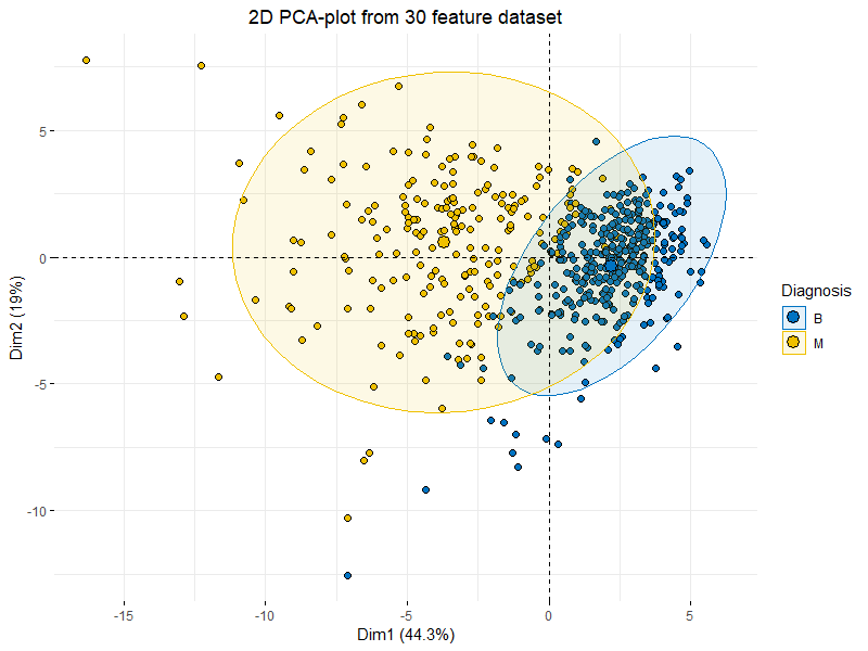 Basic 2D PCA-plot showing clustering of “Benign” and “Malignant” tumors across 30 features.
Make sure to follow my profile if you enjoy this article and want to see more!
Setup
For this article we’ll be using the Breast Cancer Wisconsin data set from the UCI Machine learning repo as our data.
Go ahead and load it for yourself if you want to follow along:
wdbc <- read.csv("wdbc.csv", header = F)features <- c("radius", "texture", "perimeter", "area", "smoothness", "compactness", "concavity", "concave_points", "symmetry", "fractal_dimension")names(wdbc) <- c("id", "diagnosis", paste0(features,"_mean"), paste0(features,"_se"), paste0(features,"_worst"))The code above will simply load the data and name all 32 variables.
The ID, diagnosis and ten distinct (30) features.
From UCI:
“The mean, standard error, and “worst” or largest (mean of the three largest values) of these features were computed for each image, resulting in 30 features.
For instance, field 3 is Mean Radius, field 13 is Radius SE, field 23 is Worst Radius.”
Why PCA?
Right, so now we’ve loaded our data and find ourselves with 30 variables (thus excluding our response “diagnosis” and the irrelevant ID-variable).
Now some of you might be saying “30 variable is a lot” and some might say “Pfft..
Only 30? I’ve worked with THOUSANDS!!” but rest assured that this is equally applicable in either scenario..!
 There’s a few pretty good reasons to use PCA.
The plot at the very beginning af the article is a great example of how one would plot multi-dimensional data by using PCA, we actually capture 63.3% (Dim1 44.3% + Dim2 19%) of variance in the entire dataset by just using those two principal components, pretty good when taking into consideration that the original data consisted of 30 features which would be impossible to plot in any meaningful way.
A very powerful consideration is to acknowledge that we never specified a response variable or anything else in our PCA-plot indicating whether a tumor was “benign” or “malignant”.
It simply turns out that when we try to describe variance in the data using the linear combinations of the PCA we find some pretty obvious clustering and separation between the “benign” and “malignant” tumors! This makes a great case for developing a classification model based on our features!
Another major “feature” (no pun intended) of PCA is that it can actually directly improve performance of your models, please take a look at this great article to read more:
Dimensionality Reduction — Does PCA really improve classification outcome?
Introduction
towardsdatascience.com
What is PCA and how does it work?
Lets get something out the way immediately, PCAs primary purpose is NOT as a ways of feature removal! PCA can reduce dimensionality but it wont reduce the number of features / variables in your data. What this means is that you might discover that you can explain 99% of variance in your 1000 feature dataset by just using 3 principal components but you still need those 1000 features to construct those 3 principal components, this also means that in the case of predicting on future data you still need those same 1000 features on your new observations to construct the corresponding principal components.
Right, right enough of that, how does it work?
Since this is purely introductory I’ll skip the math and give you a quick rundown of the workings of PCA:
Standardize the data (Center and scale).
Calculate the Eigenvectors and Eigenvalues from the covariance matrix or correlation matrix (One could also use Singular Vector Decomposition).
Sort the Eigenvalues in descending order and choose the K largest Eigenvectors (Where K is the desired number of dimensions of the new feature subspace k ≤ d).
Construct the projection matrix W from the selected K Eigenvectors.
Transform the original dataset X via W to obtain a K-dimensional feature subspace Y.
This might sound a bit complicated if you haven’t had a few courses in algebra, but the gist of it is to transform our data from it’s initial state X to a subspace Y with K dimensions where K is — more often than not — less than the original dimensions of X.
Thankfully this is easily done using R!
PCA on our tumor data
So now we understand a bit about how PCA works and that should be enough for now.
Lets actually try it out:
wdbc.pr <- prcomp(wdbc[c(3:32)], center = TRUE, scale = TRUE)summary(wdbc.pr)This is pretty self-explanatory, the ‘prcomp’ function runs PCA on the data we supply it, in our case that’s ‘wdbc[c(3:32)]’ which is our data excluding the ID and diagnosis variables, then we tell R to center and scale our data (thus standardizing the data).
Finally we call for a summary:
 The values of the first 10 principal components
Recall that a property of PCA is that our components are sorted from largest to smallest with regard to their standard deviation (Eigenvalues).
So let’s make sense of these:
Standard deviation: This is simply the eigenvalues in our case since the data has been centered and scaled (standardized)
Proportion of Variance: This is the amount of variance the component accounts for in the data, ie.
PC1 accounts for >44% of total variance in the data alone!
Cumulative Proportion: This is simply the accumulated amount of explained variance, ie.
if we used the first 10 components we would be able to account for >95% of total variance in the data.
Right, so how many components do we want? We obviously want to be able to explain as much variance as possible but to do that we would need all 30 components, at the same time we want to reduce the number of dimensions so we definitely want less than 30!
Since we standardized our data and we now have the corresponding eigenvalues of each PC we can actually use these to draw a boundary for us.
Since an eigenvalues <1 would mean that the component actually explains less than a single explanatory variable we would like to discard those.
If our data is well suited for PCA we should be able to discard these components while retaining at least 70–80% of cumulative variance.
Lets plot and see:
screeplot(wdbc.pr, type = "l", npcs = 15, main = "Screeplot of the first 10 PCs")abline(h = 1, col="red", lty=5)legend("topright", legend=c("Eigenvalue = 1"), col=c("red"), lty=5, cex=0.6)cumpro <- cumsum(wdbc.pr$sdev^2 / sum(wdbc.pr$sdev^2))plot(cumpro[0:15], xlab = "PC #", ylab = "Amount of explained variance", main = "Cumulative variance plot")abline(v = 6, col="blue", lty=5)abline(h = 0.88759, col="blue", lty=5)legend("topleft", legend=c("Cut-off @ PC6"), col=c("blue"), lty=5, cex=0.6)
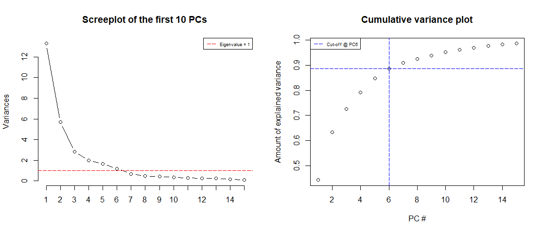 Screeplot of the Eigenvalues of the first 15 PCs (left) & Cumulative variance plot (right)
We notice is that the first 6 components has an Eigenvalue >1 and explains almost 90% of variance, this is great! We can effectively reduce dimensionality from 30 to 6 while only “loosing” about 10% of variance!
We also notice that we can actually explain more than 60% of variance with just the first two components.
Let’s try plotting these:
plot(wdbc.pr$x[,1],wdbc.pr$x[,2], xlab="PC1 (44.3%)", ylab = "PC2 (19%)", main = "PC1 / PC2 - plot")
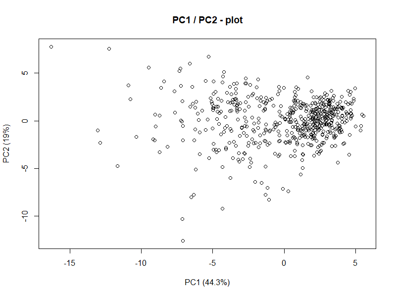 Alright, this isn’t really too telling but consider for a moment that this is representing 60%+ of variance in a 30 dimensional dataset. But what do we see from this? There’s some clustering going on in the upper/middle-right. Lets also consider for a moment what the goal of this analysis actually is.
We want to explain difference between malignant and benign tumors.
Let’s actually add the response variable (diagnosis) to the plot and see if we can make better sense of it:
library("factoextra")fviz_pca_ind(wdbc.pr, geom.ind = "point", pointshape = 21, pointsize = 2, fill.ind = wdbc$diagnosis, col.ind = "black", palette = "jco", addEllipses = TRUE, label = "var", col.var = "black", repel = TRUE, legend.title = "Diagnosis") + ggtitle("2D PCA-plot from 30 feature dataset") + theme(plot.title = element_text(hjust = 0.5))
 This is essentially the exact same plot with some fancy ellipses and colors corresponding to the diagnosis of the subject and now we see the beauty of PCA.
With just the first two components we can clearly see some separation between the benign and malignant tumors.
This is a clear indication that the data is well-suited for some kind of classification model (like discriminant analysis).
What’s next?
Our next immediate goal is to construct some kind of model using the first 6 principal components to predict whether a tumor is benign or malignant and then compare it to a model using the original 30 variables.
 From the plot we can see each of the 50 states represented in a simple two-dimensional space.
The states that are close to each other on the plot have similar data patterns in regards to the variables in the original dataset.
We can also see that the certain states are more highly associated with certain crimes than others.
For example, Georgia is the state closest to the variable Murder in the plot.
If we take a look at the states with the highest murder rates in the original dataset, we can see that Georgia is actually at the top of the list:
#display states with highest murder rates in original dataset
head(USArrests[order(-USArrests$Murder),])
Murder Assault UrbanPop Rape
Georgia 17.4 211 60 25.8
Mississippi 16.1 259 44 17.1
Florida 15.4 335 80 31.9
Louisiana 15.4 249 66 22.2
South Carolina 14.4 279 48 22.5
Alabama 13.2 236 58 21.2

 Lower triangles provide scatter plots and upper triangles provide correlation values.
Petal length and petal width are highly correlated.
Same way sepal length and petal length , Sepeal length, and petal width are also highly correlated.
This leads to multicollinearity issues.
So if we predict the model based on this dataset may be erroneous.
One way handling these kinds of issues is based on PCA.
Cluster optimization in R
 Now the correlation coefficients are zero, so we can get rid of multicollinearity issues.
 PC1 explains about 73.7% and PC2 explained about 22.1% of variability.
Arrows are closer to each other indicates the high correlation.
For example correlation between Sepal Width vs other variables is weakly correlated.
Another way interpreting the plot is PC1 is positively correlated with the variables Petal Length, Petal Width, and Sepal Length, and PC1 is negatively correlated with Sepal Width.
PC2 is highly negatively correlated with Sepal Width.
Bi plot is an important tool in PCA to understand what is going on in the dataset.
Difference between association and correlation
 Basic 2D PCA-plot showing clustering of “Benign” and “Malignant” tumors across 30 features.
Make sure to follow my profile if you enjoy this article and want to see more!
 There’s a few pretty good reasons to use PCA.
The plot at the very beginning af the article is a great example of how one would plot multi-dimensional data by using PCA, we actually capture 63.3% (Dim1 44.3% + Dim2 19%) of variance in the entire dataset by just using those two principal components, pretty good when taking into consideration that the original data consisted of 30 features which would be impossible to plot in any meaningful way.
A very powerful consideration is to acknowledge that we never specified a response variable or anything else in our PCA-plot indicating whether a tumor was “benign” or “malignant”.
It simply turns out that when we try to describe variance in the data using the linear combinations of the PCA we find some pretty obvious clustering and separation between the “benign” and “malignant” tumors! This makes a great case for developing a classification model based on our features!
Another major “feature” (no pun intended) of PCA is that it can actually directly improve performance of your models, please take a look at this great article to read more:
 The values of the first 10 principal components
Recall that a property of PCA is that our components are sorted from largest to smallest with regard to their standard deviation (Eigenvalues).
So let’s make sense of these:
Standard deviation: This is simply the eigenvalues in our case since the data has been centered and scaled (standardized)
Proportion of Variance: This is the amount of variance the component accounts for in the data, ie.
PC1 accounts for >44% of total variance in the data alone!
Cumulative Proportion: This is simply the accumulated amount of explained variance, ie.
if we used the first 10 components we would be able to account for >95% of total variance in the data.
Right, so how many components do we want? We obviously want to be able to explain as much variance as possible but to do that we would need all 30 components, at the same time we want to reduce the number of dimensions so we definitely want less than 30!
Since we standardized our data and we now have the corresponding eigenvalues of each PC we can actually use these to draw a boundary for us.
Since an eigenvalues <1 would mean that the component actually explains less than a single explanatory variable we would like to discard those.
If our data is well suited for PCA we should be able to discard these components while retaining at least 70–80% of cumulative variance.
Lets plot and see:
screeplot(wdbc.pr, type = "l", npcs = 15, main = "Screeplot of the first 10 PCs")abline(h = 1, col="red", lty=5)legend("topright", legend=c("Eigenvalue = 1"), col=c("red"), lty=5, cex=0.6)cumpro <- cumsum(wdbc.pr$sdev^2 / sum(wdbc.pr$sdev^2))plot(cumpro[0:15], xlab = "PC #", ylab = "Amount of explained variance", main = "Cumulative variance plot")abline(v = 6, col="blue", lty=5)abline(h = 0.88759, col="blue", lty=5)legend("topleft", legend=c("Cut-off @ PC6"), col=c("blue"), lty=5, cex=0.6)
 Screeplot of the Eigenvalues of the first 15 PCs (left) & Cumulative variance plot (right)
We notice is that the first 6 components has an Eigenvalue >1 and explains almost 90% of variance, this is great! We can effectively reduce dimensionality from 30 to 6 while only “loosing” about 10% of variance!
We also notice that we can actually explain more than 60% of variance with just the first two components.
Let’s try plotting these:
plot(wdbc.pr$x[,1],wdbc.pr$x[,2], xlab="PC1 (44.3%)", ylab = "PC2 (19%)", main = "PC1 / PC2 - plot")
 Alright, this isn’t really too telling but consider for a moment that this is representing 60%+ of variance in a 30 dimensional dataset. But what do we see from this? There’s some clustering going on in the upper/middle-right. Lets also consider for a moment what the goal of this analysis actually is.
We want to explain difference between malignant and benign tumors.
Let’s actually add the response variable (diagnosis) to the plot and see if we can make better sense of it:
library("factoextra")fviz_pca_ind(wdbc.pr, geom.ind = "point", pointshape = 21, pointsize = 2, fill.ind = wdbc$diagnosis, col.ind = "black", palette = "jco", addEllipses = TRUE, label = "var", col.var = "black", repel = TRUE, legend.title = "Diagnosis") + ggtitle("2D PCA-plot from 30 feature dataset") + theme(plot.title = element_text(hjust = 0.5))
 This is essentially the exact same plot with some fancy ellipses and colors corresponding to the diagnosis of the subject and now we see the beauty of PCA.
With just the first two components we can clearly see some separation between the benign and malignant tumors.
This is a clear indication that the data is well-suited for some kind of classification model (like discriminant analysis).